Analyzing Intent Distribution
Understanding User needs in your AI Agent
The Intent Distribution Chart in the Mindlytics visualization portal gives product managers a live behavioral snapshot of what users are trying to accomplish across conversations.
Here’s how it works inside the portal:
Create a Intent Distribution Chart
Within the Mindlytics portal, tap [Create+] button and select Intent Distribution Chart. This creates a pie chart, with the aggregate of detected intents across all conversations during the selected time range.
Apply relevant filters
- Compose User List:
- Select Cohort: By default the chart is created using the data from [All Users] cohort (default cohort that includes all active users). You may also change the user cohort by clicking the [All User] if you have configured custom cohorts in your app or apply filters to the selected cohort.
- Filter users by trait: You can filter users within the current cohort based on user trait values by clicking + With Traits link below the cohort name. For example, if you want to include only male users in the list, you could choose the trait gender with the value equal to "male".
- Filter users by Event: You can also filter users within a cohort based on the EVENTS generated by the user by clicking + Performed link below the cohort name. For example, you could filter users who asked for human agent by filtering by the event Agent Requested
- Merge users across Cohorts: You can merge more users to the list by clicking + Add users below to select more user cohorts and apply custom filters as described above.
- Select Date Range: You can choose the data range from the date picker or pick one of the pre-defined date shortcuts.
View Chart
The chart visualizes intent volume as a pie chart (for proportional overview). Each slice of the pie represents a detected intent and displays, the unique intent count and the percentage of total number of intents detected.
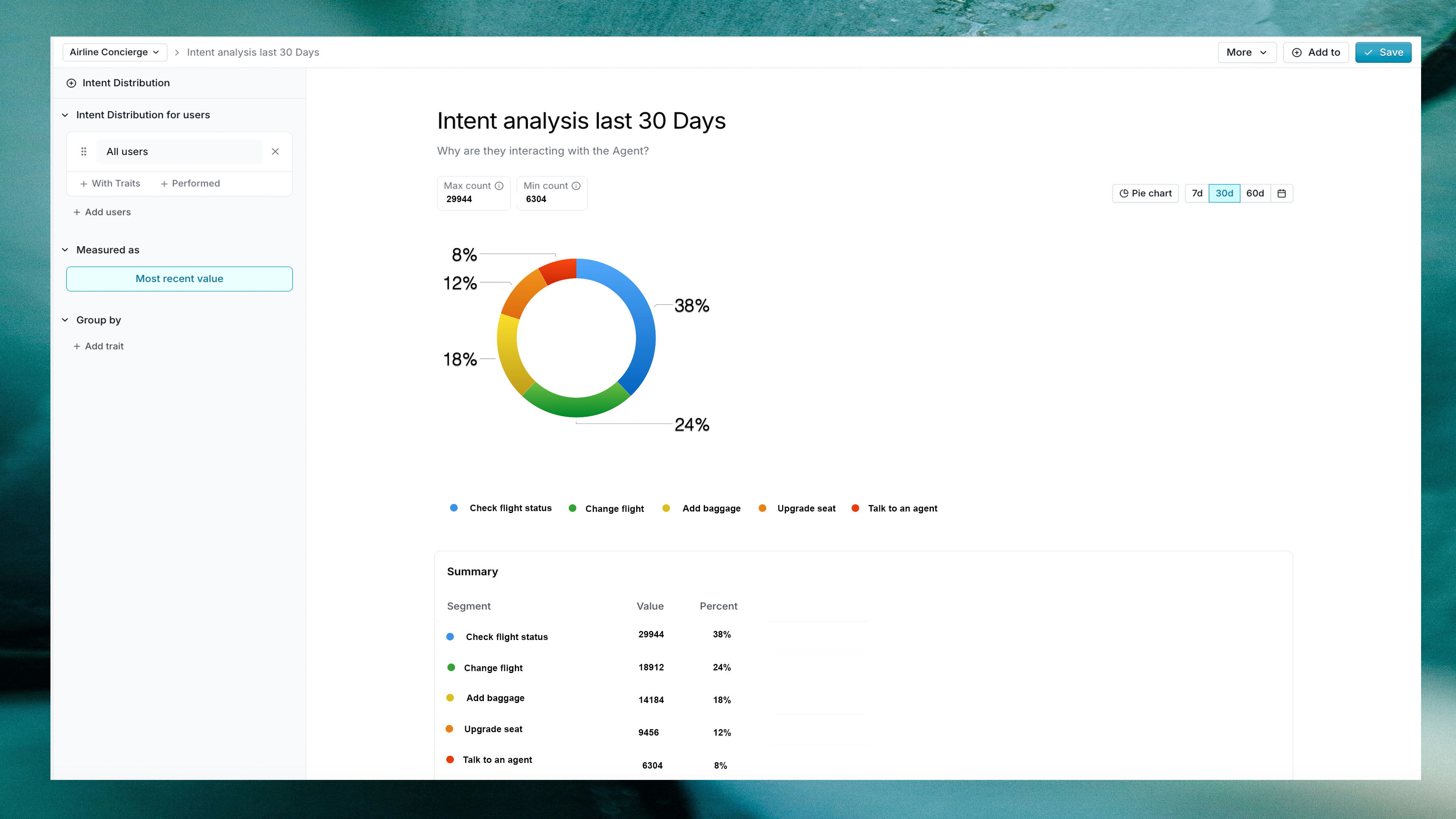
- 38% →
Check flight status - 24% →
Change flight - 18% →
Add Baggage - 12% →
Upgrade seat - 8% →
Talk to an Agent
Drill Down into Specific Intents
You may click a specific intent slice to see the number of intents counted. From the drop down, you could also export the list of unique userIds that contributed to the specific intent for further analysis.
Compare by User Trait values
You could compare any chart visualization by different user trait or user property configured in your agent. For example, if you are tracking agent software release by the user trait release, you could click by trait below Group by on the left side filter menu and choose the release values you want to compare the intent distribution. This will result in displaying multiple charts, each representing the release value selected enabling you to compare intent distribution across multiple agent releases.